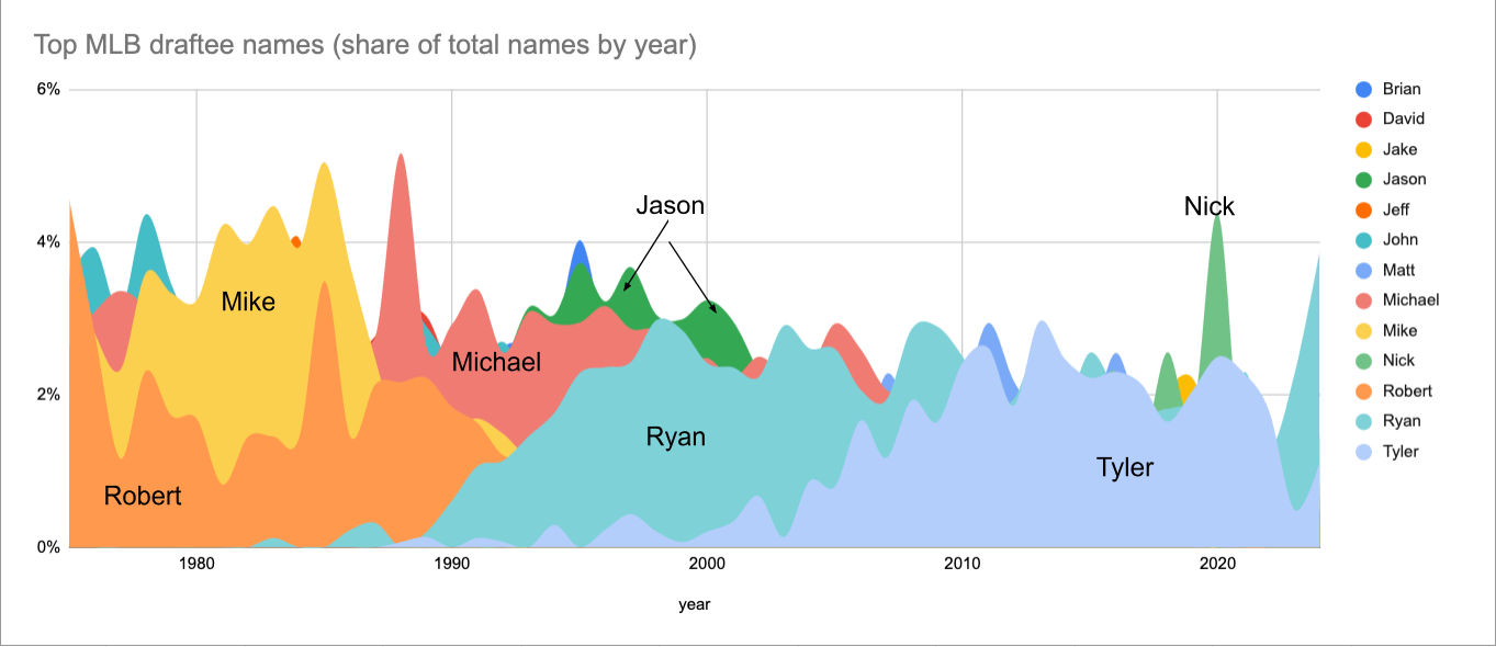
For some reason I wanted to know if there was any trend in first names of MLB draftees. If you ask me, the first names of MLB draftees & players have some kind of perceived stereotype, and I wanted to see if that was true. For example, it seems like a lot of JJs are drafted.
First Step: Get (Extract) the data
From googling around and just looking at data on the internet for many years, I knew there was an MLB Stats-API. I had been a member of the mlbdata subreddit for many years. I knew there was a draft endpoint from looking around at the Python wrapper for MLB Stats API Created by Todd Roberts. You can look at what the results of an API call to the draft endpoint looks like for a specific year. For this project, I wanted the useName value in the person object to analyze, as the firstName field has Christopher’s while I wanted Chris’s. At the beginning I wasn’t sure what I would do with this data, so for now I wanted to just loop through every year of MLB drafts and throw the data into a csv. I included some other fields in my final dataframe, in case I wanted to use them. The blank dataframe I created (with pandas as pd) looked like this:
df = pd.DataFrame({
    'year': pd.Series(dtype='int'),
    'pickRound': pd.Series(dtype='str'),
    'pickNumber': pd.Series(dtype='int'),
    'fullName': pd.Series(dtype='str'),
    'firstName': pd.Series(dtype='str'),
    'lastName': pd.Series(dtype='str'),
    'useName': pd.Series(dtype='str')
})
Then I had to start looping through draft years and populating this dataframe. For each year between 1975 and 2024 I request the draft endpoint and parse the json from it. The first few lines of my loop looked like this:
for year in range(1975, 2025):
  year_string = str(year)
  response_API = requests.get('https://statsapi.mlb.com/api/v1/draft/' + year_string)
  data = response_API.text
  parse_json = json.loads(data)
I knew the data I needed and it required me looping through the rounds array and then looping through the picks array. There is an exception in there if a specific value was not found. I noticed that there were a few places with missing data in the MLB Stats-API and this is how I chose to correct it, with the key KeyError exception for some values. I determined that the small amount of missing data would not affect my results too much. You can see it also creates a new row and adds it to the big dataframe. The code looked like this:
  for round_info in parse_json['drafts']['rounds']:
    for pick in round_info['picks']:
      pickRound = pick['pickRound']
      pickNumber = pick['pickNumber']
      # Extract the useName and append it to the list
      try:
        useName = pick['person']['useName']
        fullName = pick['person']['fullName']
        firstName = pick['person']['firstName']
        lastName = pick['person']['lastName']
      except KeyError:
        useName = ''
        fullName = ''
        firstName = ''
        lastName = ''
      new_row = pd.DataFrame([{'year': year, 'pickRound': pickRound, 'pickNumber': pickNumber, 'fullName': fullName, 'firstName': firstName, 'lastName': lastName, 'useName': useName}])
      df = pd.concat([df, new_row], ignore_index=True)
Finally I leave the loop and assign the dataframe to a csv file.
df.to_csv('all_drafts.csv', index=False)
Second Step: Transform the data
I had to figure out what I wanted to do with the data. I googled stuff like “popular names over time visualization” to get ideas. I found something I really liked from the chartr newsletter from May 15, 2023. (ChartR is now owned by Sherwood News. Here is the chart, in case the link no longer works)
This is called an area chart and seemed like a code option to visualize MLB draftee first names over time. What I decided to do with the data at this point is to use any name that was the top name in a single draft (those names being ‘Robert’ ‘John’ ‘Michael’ ‘Mike’ ‘Jeff’ ‘David’ ‘Jason’ ‘Brian’ ‘Ryan’ ‘Matt’ ‘Tyler’ ‘Nick’ ‘Jake’) and put those names on my area chart. That way the chart has every name that was ever the leader plus its trend to and from that point of it being a leader. Therefore the step to step process was: 1) get all the top names by year; 2) Get the counts of each of those names for every year; 3) Pivot the table so that the names were columns - this is for use in Google Sheets / Excel. These steps ended up looking like this:
#read in the data
df = pd.read_csv('all_drafts.csv', index_col=None)

# Group by year and name, then count occurrences
name_counts = df.groupby(['year', 'useName']).size().reset_index(name='count')

# Sort by year and then by count in descending order
sorted_name_counts = name_counts.sort_values(by=['year', 'count'], ascending=[True, False])

unique_names = sorted_name_counts.groupby('year').head(1)['useName'].unique()

unique_names_df = name_counts[name_counts['useName'].isin(unique_names)]

# Pivot the DataFrame
pivot_df = unique_names_df.pivot(index='year', columns='useName', values='count')

final_df = pivot_df.fillna(0).astype(int).reset_index()

final_df.to_csv('top_names.csv', index=False)
The data ended up looking like this, but showing all the years and I added the total_picks column as well in a separate process. This is used to get the share percentage of that name in the draft.
| year | Brian | David | Jake | Jason | Jeff | John | Matt | Michael | Mike | Nick | Robert | Ryan | Tyler | total_picks |
|---|---|---|---|---|---|---|---|---|---|---|---|---|---|---|
| 1975 | 5 | 18 | 0 | 2 | 8 | 24 | 0 | 18 | 25 | 1 | 31 | 0 | 0 | 679 |
| 1976 | 9 | 18 | 0 | 0 | 11 | 28 | 0 | 22 | 20 | 1 | 20 | 0 | 0 | 713 |
| 1977 | 5 | 14 | 0 | 0 | 14 | 24 | 0 | 26 | 18 | 1 | 9 | 0 | 0 | 774 |
| 1978 | 9 | 19 | 0 | 0 | 17 | 34 | 3 | 24 | 28 | 2 | 18 | 0 | 0 | 779 |
I added the data to Google Sheets and styled the area chart. Here is the final result. If you’d like a link to the Google Sheets, contact me.
